Chapter - Feature Engineering
Supplementary chapter prepared for the BWXT Data Science Workforce Training Pilot. This material is original to the program and is not derived from Automate the Boring Stuff with Python; it is written in a similar tone for continuity with the other chapters.
About this chapter
So far, you have learned how to write Python scripts, load files, organize data in tables, and summarize datasets. Those skills help you answer an important question before modeling: What is in my data?
This chapter focuses on the next question: How should the data be prepared so a model can use it?
Feature engineering is the process of creating, transforming, selecting, and organizing input data for analysis or machine learning. A feature may be a column in a spreadsheet, a measurement from a sensor, a pixel statistic from an image, or a value calculated from other fields.
The examples in this chapter use manufacturing, inspection, and welding language, but the ideas apply to many types of data.
What is a feature?
A feature is an input value used by a model.
For example, imagine a table where each row describes one weld inspection:
| weld_id | material | weld_length_mm | operator_birthdate | defect_class |
|---|---|---|---|---|
| W001 | steel | 42.5 | 1988-04-12 | no_defect |
| W002 | alloy | 38.0 | 1976-09-03 | porosity |
| W003 | steel | 51.2 | 1992-01-25 | crack |
Possible features include:
materialweld_length_mmoperator_birthdate- A new column calculated from
operator_birthdate, such asoperator_age
The label, or target, is usually the thing you want the model to predict. In this example, defect_class is the label.
Why feature engineering matters
Models learn from the information you give them. If important information is missing, poorly formatted, or hidden inside another field, the model may struggle.
Feature engineering helps you:
- Turn raw fields into useful measurements.
- Convert text categories into numbers.
- Scale numeric values so one large column does not dominate another.
- Put data into the shape expected by a model.
- Reduce noise by dropping weak or duplicate features.
- Handle imbalanced classes before training.
- Explain clearly why certain inputs were used.
Feature engineering does not replace domain knowledge. A welding engineer, inspector, or process owner may know which measurements are meaningful and which are artifacts of the data collection process.
Categorical and continuous variables
Most features can be grouped into two broad types:
| Variable type | Meaning | Example |
|---|---|---|
| Categorical | Values represent groups, names, labels, or categories | Material type, shift, defect class |
| Continuous | Values are numeric measurements that can vary over a range | Temperature, weld length, voltage |
This distinction matters because the two types are usually prepared differently.
Categorical values often need to be encoded. Continuous values often need to be scaled, transformed, or checked for outliers.
Types of categorical data
Categorical variables describe group membership. There are several common types.
| Type | Meaning | Example |
|---|---|---|
| Nominal | Categories have no natural order | steel, aluminum, titanium |
| Ordinal | Categories have a meaningful order | low, medium, high |
| Binary | Only two categories | pass, fail |
| Multi-label | One row may belong to more than one category | porosity and undercut in the same image |
Nominal categories
Nominal categories are names or groups without a built-in ranking.
For example:
materials = ['steel', 'aluminum', 'titanium']It would be misleading to say steel = 1, aluminum = 2, and titanium = 3 if the numbers imply an order. A model might think titanium is "greater than" steel in a mathematical way, even though these are just names.
Ordinal categories
Ordinal categories have a meaningful order.
For example:
risk_level = ['low', 'medium', 'high']In this case, mapping values to numbers may make sense:
risk_map = {
    'low': 0,
    'medium': 1,
    'high': 2,
}
The important question is whether the order is real and useful. If the categories are just names, do not treat them like ordered values.
Binary categories
Binary categories have two values:
inspection_result = ['pass', 'fail']These can often be represented with 0 and 1:
result_map = {
    'pass': 0,
    'fail': 1,
}
Always document what 0 and 1 mean. Otherwise, another person may not know which value represents the positive class.
Multi-label categories
Sometimes one row can have more than one label.
For example, a weld image might contain both porosity and undercut.
labels = ['porosity', 'undercut']This is different from ordinary multi-class classification, where each row belongs to exactly one class. Multi-label problems usually require a separate yes-or-no column for each possible label.
Types of continuous variables
Continuous variables are numeric measurements. They can take many possible values across a range.
| Type | Meaning | Example |
|---|---|---|
| Interval | Differences are meaningful, but zero does not mean absence | Temperature in Celsius |
| Ratio | Differences and ratios are meaningful; zero means none | Length, area, mass, time |
| Count | Whole-number quantity | Number of defects in an image |
| Time-based | Dates, timestamps, durations, or repeated readings over time | Inspection date, sensor timestamp |
Interval variables
Temperature in Celsius is an interval variable. The difference between 20 and 30 degrees is meaningful, but 0 degrees Celsius does not mean "no temperature."
Ratio variables
Weld length is a ratio variable. A weld that is 40 mm long is twice as long as a weld that is 20 mm long. A value of 0 mm means no length.
Counts
Counts are whole numbers:
number_of_indications = [0, 1, 2, 3, 4]Counts are numeric, but they often have skew. Many rows may have 0, while a small number of rows may have large counts.
Time-based variables
Dates and timestamps are common in real datasets:
inspection_date = '2026-04-26'A model usually cannot use a raw date string directly. You may need to extract useful pieces, such as year, month, day of week, shift, or age at inspection time.
Creating new features from existing fields
Raw fields are not always the best model inputs. Sometimes the useful information is hidden inside a field.
For example, operator_birthdate may be less useful than operator_age.
import pandas as pd

df = pd.DataFrame({
    'operator_birthdate': ['1988-04-12', '1976-09-03', '1992-01-25'],
    'inspection_date': ['2026-04-26', '2026-04-26', '2026-04-26'],
})

df['operator_birthdate'] = pd.to_datetime(df['operator_birthdate'])
df['inspection_date'] = pd.to_datetime(df['inspection_date'])

age_days = df['inspection_date'] - df['operator_birthdate']
df['operator_age'] = (age_days.dt.days / 365.25).astype(int)

print(df[['operator_birthdate', 'operator_age']])
Output:
  operator_birthdate  operator_age
0         1988-04-12            38
1         1976-09-03            49
2         1992-01-25            34
The new operator_age feature is easier for many models to use than the original birthdate.
More examples of derived features
Feature engineering often means turning existing data into more direct measurements.
| Existing fields | New feature | Why it may help |
|---|---|---|
birthdate, inspection_date |
age_at_inspection |
Converts date strings into a useful numeric value |
start_time, end_time |
inspection_duration_seconds |
Captures how long a process took |
defect_width, defect_height |
defect_area |
Combines two dimensions into size |
max_temperature, min_temperature |
temperature_range |
Captures process variation |
image_pixels |
mean_pixel, std_pixel |
Summarizes image brightness and contrast |
x_position, y_position |
distance_from_center |
Captures location in a part or image |
Here is a small example:
df = pd.DataFrame({
    'defect_width_mm': [2.0, 5.5, 1.2],
    'defect_height_mm': [1.5, 2.0, 0.8],
    'max_temperature_c': [925, 940, 910],
    'min_temperature_c': [870, 880, 865],
})

df['defect_area_mm2'] = df['defect_width_mm'] * df['defect_height_mm']
df['temperature_range_c'] = df['max_temperature_c'] - df['min_temperature_c']

print(df)
Feature engineering is useful when the new feature has a reason to exist. Do not create hundreds of random combinations just because you can.
Avoiding data leakage
Data leakage happens when a feature gives the model information that would not be available at prediction time.
For example, suppose you are building a model to predict whether a weld will fail inspection before final review. These columns would be suspicious:
final_inspection_resultrepair_requiredfailure_codedisposition_notes
Those fields may be created after the inspection outcome is already known. If you use them as inputs, the model may look excellent during testing but fail in real use.
Before using a feature, ask:
- Would this value be available when the model makes its prediction?
- Was this value created before or after the label?
- Is this feature just another version of the answer?
One-hot encoding categorical data
Many models require numeric input. A category like material = 'steel' must be converted into numbers.
One common method is one-hot encoding. It creates one column for each category.
Original data:
| weld_id | material |
|---|---|
| W001 | steel |
| W002 | alloy |
| W003 | steel |
| W004 | titanium |
One-hot encoded data:
| weld_id | material_alloy | material_steel | material_titanium |
|---|---|---|---|
| W001 | 0 | 1 | 0 |
| W002 | 1 | 0 | 0 |
| W003 | 0 | 1 | 0 |
| W004 | 0 | 0 | 1 |
In pandas, use get_dummies():
import pandas as pd

df = pd.DataFrame({
    'weld_id': ['W001', 'W002', 'W003', 'W004'],
    'material': ['steel', 'alloy', 'steel', 'titanium'],
})

encoded_df = pd.get_dummies(df, columns=['material'], dtype=int)

print(encoded_df)
Output:
  weld_id  material_alloy  material_steel  material_titanium
0    W001               0               1                  0
1    W002               1               0                  0
2    W003               0               1                  0
3    W004               0               0                  1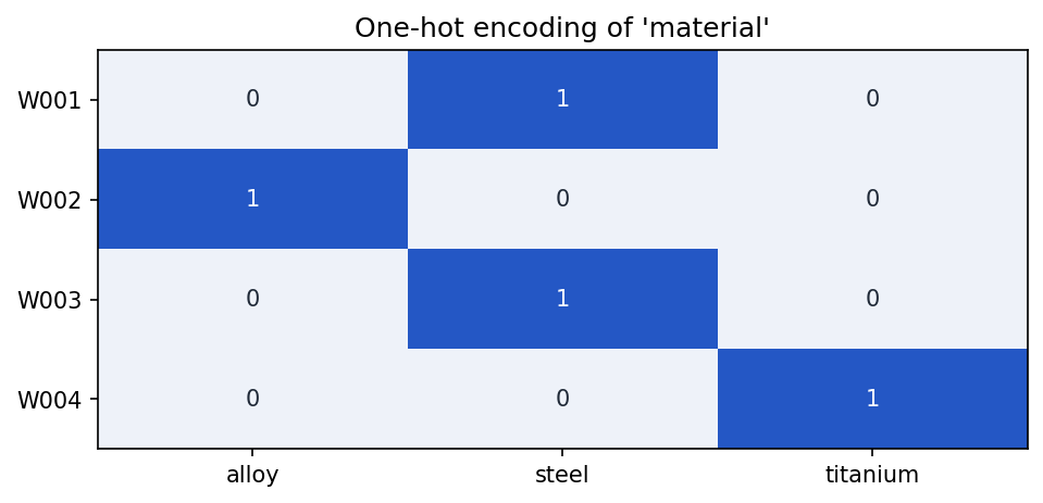
material column with one binary column per category — exactly one 1 per row.One-hot encoding works well for categories with a small number of possible values. It can become difficult when a column has thousands of unique values, such as part serial numbers or free-text operator notes.
Scaling numeric values
Numeric features can have very different ranges:
| Feature | Example range |
|---|---|
weld_length_mm |
10 to 100 |
temperature_c |
800 to 1200 |
defect_area_pixels |
0 to 200000 |
Some models are sensitive to these ranges. A large-valued feature may dominate a smaller-valued feature even if it is not more important.
Scaling changes numeric values to a more consistent range.
Min-max scaling
Min-max scaling moves values into a fixed range, often 0 to 1.
from sklearn.preprocessing import MinMaxScaler
import pandas as pd

df = pd.DataFrame({
    'weld_length_mm': [25, 50, 75, 100],
})

scaler = MinMaxScaler()
df['weld_length_scaled'] = scaler.fit_transform(df[['weld_length_mm']])

print(df)
Output:
   weld_length_mm  weld_length_scaled
0              25            0.000000
1              50            0.333333
2              75            0.666667
3             100            1.000000
Standard scaling
Standard scaling changes values so they have a mean near 0 and a standard deviation near 1.
from sklearn.preprocessing import StandardScaler

df = pd.DataFrame({
    'temperature_c': [870, 885, 900, 930, 950],
})

scaler = StandardScaler()
df['temperature_scaled'] = scaler.fit_transform(df[['temperature_c']])

print(df)
This is often useful for models such as logistic regression, support vector machines, k-nearest neighbors, and neural networks.
Robust scaling
Robust scaling uses the median and quartiles, so it is less affected by outliers.
from sklearn.preprocessing import RobustScaler

df = pd.DataFrame({
    'defect_area_pixels': [12, 15, 18, 20, 5000],
})

scaler = RobustScaler()
df['defect_area_scaled'] = scaler.fit_transform(df[['defect_area_pixels']])

print(df)
Robust scaling can be helpful when a small number of extreme values are real and should not simply be deleted.
Plotting the same feature (with a few extreme outliers) under each scaler shows how they differ — only the shape and axis change, not the relative spacing:
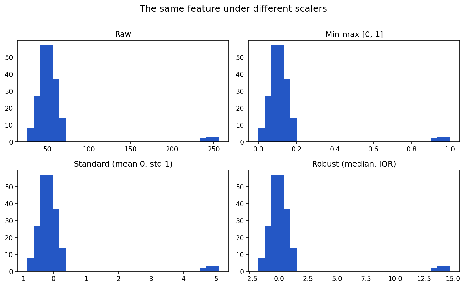
Show the code that generated this plot
import numpy as np
import matplotlib.pyplot as plt
from sklearn.preprocessing import MinMaxScaler, StandardScaler, RobustScaler

rng = np.random.default_rng(0)
# A feature with a few extreme outliers (e.g. defect area in pixels)
values = np.concatenate([rng.normal(50, 10, 200), rng.normal(250, 8, 8)]).reshape(-1, 1)

panels = [
    ('Raw', values.ravel()),
    ('Min-max [0, 1]', MinMaxScaler().fit_transform(values).ravel()),
    ('Standard (mean 0, std 1)', StandardScaler().fit_transform(values).ravel()),
    ('Robust (median, IQR)', RobustScaler().fit_transform(values).ravel()),
]
fig, axes = plt.subplots(2, 2, figsize=(10, 6))
for ax, (title, data) in zip(axes.ravel(), panels):
    ax.hist(data, bins=30, color='#2457c5')
    ax.set_title(title)
plt.tight_layout()
plt.show()
Fit scalers only on training data
When building a model, split your data first. Then fit the scaler only on the training set.
from sklearn.model_selection import train_test_split
from sklearn.preprocessing import StandardScaler

X_train, X_test, y_train, y_test = train_test_split(
    X,
    y,
    test_size=0.2,
    random_state=42,
)

scaler = StandardScaler()
X_train_scaled = scaler.fit_transform(X_train)
X_test_scaled = scaler.transform(X_test)
Notice the difference:
fit_transform()is used on training data.transform()is used on test data.
This prevents information from the test set from leaking into the training process.
Transforming size, shape, and label type for modeling
Machine learning libraries expect data in specific formats. A common source of errors is giving the model the right data in the wrong shape.
Tabular model input
For many scikit-learn models:
Xshould be a 2D table with shape(number_of_rows, number_of_features).yshould be a 1D array with shape(number_of_rows,).
import numpy as np

X = np.array([
    [42.5, 880],
    [38.0, 910],
    [51.2, 895],
])

y = np.array(['no_defect', 'porosity', 'crack'])

print(X.shape)
print(y.shape)
Output:
(3, 2)
(3,)
The first dimension must match. If X has 3 rows, y must have 3 labels.
Reshaping one feature
If you have one numeric feature, it may start as a 1D array:
weld_lengths = np.array([42.5, 38.0, 51.2])
print(weld_lengths.shape)
Output:
(3,)Many scikit-learn tools expect a 2D input:
X = weld_lengths.reshape(-1, 1)
print(X.shape)
Output:
(3, 1)The -1 tells NumPy to infer the number of rows.
Image model input
Image models usually expect arrays with a specific height, width, and number of channels.
For example:
from PIL import Image
import numpy as np

image = Image.open('weld_xray.png').convert('L')
image = image.resize((224, 224))

pixels = np.array(image)
pixels = pixels / 255.0

print(pixels.shape)
Output:
(224, 224)Some neural networks expect a channel dimension:
pixels = pixels.reshape(224, 224, 1)
print(pixels.shape)
Output:
(224, 224, 1)If you have many images, the batch may have shape:
(number_of_images, height, width, channels)For example:
(1000, 224, 224, 1)Label types
Labels also need the correct format.
For binary classification, labels are often represented as 0 and 1:
y = np.array([0, 1, 0, 1])For multi-class classification, labels may be integer class IDs:
y = np.array([0, 2, 1, 0])Or one-hot encoded labels:
from sklearn.preprocessing import LabelBinarizer

labels = ['no_defect', 'porosity', 'crack', 'no_defect']

encoder = LabelBinarizer()
y_one_hot = encoder.fit_transform(labels)

print(y_one_hot)
The correct label format depends on the model and loss function. Always check the documentation for the library you are using.
Rebalancing classes
A dataset is imbalanced when one class has many more examples than another.
For example:
| defect_class | count |
|---|---|
| no_defect | 950 |
| porosity | 35 |
| crack | 15 |
A model trained on this dataset may learn to predict no_defect most of the time. Accuracy may look high, but the model may miss rare defects.
Checking class balance
class_counts = df['defect_class'].value_counts()
class_percentages = df['defect_class'].value_counts(normalize=True) * 100

print(class_counts)
print(class_percentages)
Class balance should be checked before training and again after splitting into train and test sets.
Strategy 1: Collect more data
The best solution is often to collect more examples of the rare classes.
Pros:
- Adds real information.
- Usually improves model reliability.
- Helps rare classes represent real variation.
Cons:
- May be expensive or slow.
- Rare defects may not occur often.
- Requires labeling effort.
Strategy 2: Oversampling
Oversampling increases the number of minority-class examples in the training set. The simplest version duplicates existing rows.
from sklearn.utils import resample

majority = df[df['defect_class'] == 'no_defect']
minority = df[df['defect_class'] == 'crack']

minority_oversampled = resample(
    minority,
    replace=True,
    n_samples=len(majority),
    random_state=42,
)

balanced_df = pd.concat([majority, minority_oversampled])
Pros:
- Simple to understand.
- Keeps all majority-class examples.
- Useful when the minority class is small.
Cons:
- Duplicates can cause overfitting.
- Does not add truly new information.
- Training may take longer because the dataset grows.
Strategy 3: Undersampling
Undersampling reduces the number of majority-class examples.
majority_undersampled = resample(
    majority,
    replace=False,
    n_samples=len(minority),
    random_state=42,
)

balanced_df = pd.concat([majority_undersampled, minority])
Pros:
- Simple and fast.
- Reduces training time.
- Can help when the majority class is very large.
Cons:
- Throws away data.
- May remove useful variation from the majority class.
- Can make the model less reliable if too much data is removed.
Oversampling and undersampling both end at balanced class counts, but they get there differently — one grows the minority class, the other shrinks the majority:
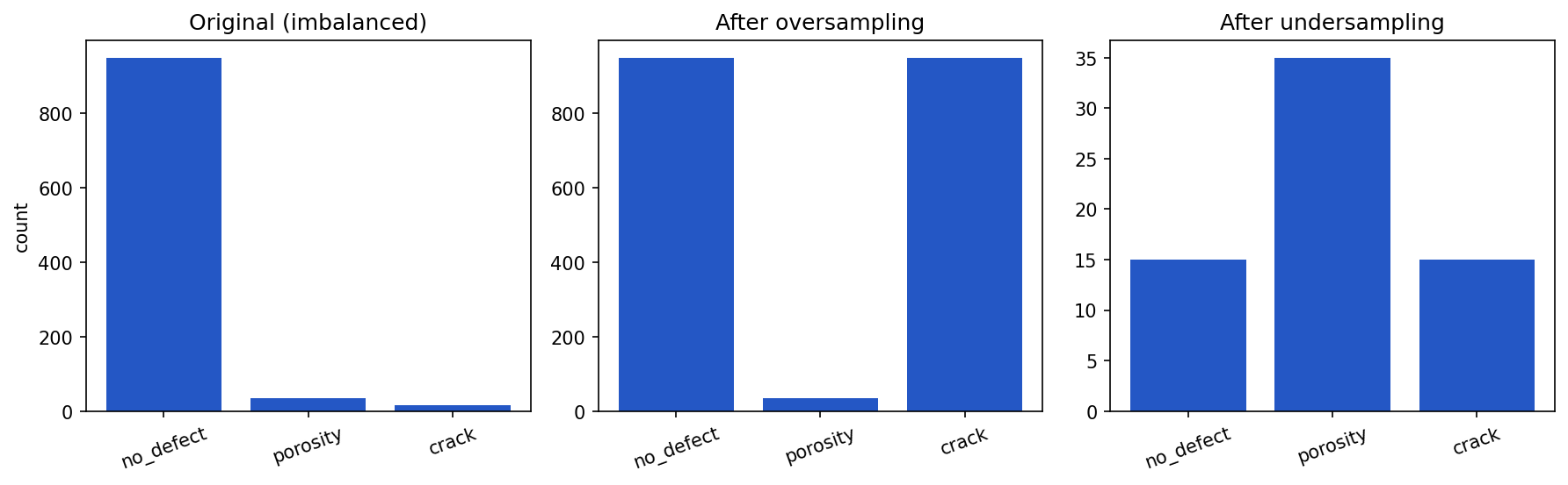
Show the code that generated this plot
import pandas as pd
import matplotlib.pyplot as plt
from sklearn.utils import resample

df = pd.DataFrame({'defect_class':
                   ['no_defect'] * 950 + ['porosity'] * 35 + ['crack'] * 15})
majority = df[df['defect_class'] == 'no_defect']
crack = df[df['defect_class'] == 'crack']

over = pd.concat([df, resample(crack, replace=True,
                  n_samples=len(majority) - len(crack), random_state=42)])
under = pd.concat([resample(majority, replace=False, n_samples=15, random_state=42),
                   df[df['defect_class'] != 'no_defect']])

order = ['no_defect', 'porosity', 'crack']
fig, axes = plt.subplots(1, 3, figsize=(12, 3.8))
for ax, (title, d) in zip(axes, [('Original (imbalanced)', df),
                                 ('After oversampling', over),
                                 ('After undersampling', under)]):
    counts = d['defect_class'].value_counts()
    ax.bar(order, [counts.get(c, 0) for c in order], color='#2457c5')
    ax.set_title(title)
plt.tight_layout()
plt.show()
Strategy 4: Synthetic examples
Some methods create synthetic minority-class examples. One common tabular method is SMOTE, which creates new points between existing minority examples.
from imblearn.over_sampling import SMOTE

smote = SMOTE(random_state=42)
X_resampled, y_resampled = smote.fit_resample(X_train, y_train)
Pros:
- Adds more minority-class training examples.
- Can reduce overfitting compared with simple duplication.
- Useful for some tabular datasets.
Cons:
- Synthetic examples may not be physically realistic.
- Can create confusing samples near class boundaries.
- Requires careful validation.
For image datasets, augmentation is a common way to create variation:
- Rotate slightly.
- Crop or shift.
- Adjust brightness or contrast.
- Flip only when the flip makes physical sense.
Do not use an augmentation that changes the meaning of the label.
Strategy 5: Class weights
Some models allow you to give rare classes more weight during training.
from sklearn.linear_model import LogisticRegression

model = LogisticRegression(class_weight='balanced')
model.fit(X_train, y_train)
Pros:
- Does not duplicate or delete examples.
- Easy to apply in many libraries.
- Keeps the original training dataset size.
Cons:
- May not be enough for severe imbalance.
- Can increase false positives.
- Still requires good examples of each class.
Strategy 6: Threshold adjustment
For binary classification, a model may output a probability. The default decision threshold is often 0.5, but that may not be best.
probabilities = model.predict_proba(X_test)[:, 1]
predictions = probabilities >= 0.30
Lowering the threshold may catch more defects, but it may also create more false alarms.
Pros:
- Useful when the cost of missing a defect is high.
- Does not require retraining the model.
- Lets stakeholders choose a tradeoff.
Cons:
- More false positives may burden inspectors.
- The right threshold depends on business risk.
- Must be evaluated with precision, recall, and confusion matrices.
Rebalancing only the training data
Rebalancing should usually be applied only to the training set.
Do not oversample or undersample the test set. The test set should represent real-world data as honestly as possible.
Identifying important features
Not every feature helps. Some features are noisy, redundant, misleading, or unavailable in real use.
Feature importance can come from several sources:
- Domain knowledge.
- Correlation with the label.
- Model-based importance.
- Permutation importance.
- Error analysis.
- Stakeholder review.
Start with domain knowledge
A domain expert may know that some values are physically meaningful:
- Heat input
- Travel speed
- Material type
- Inspection angle
- Exposure settings
- Defect location
They may also know that some values are not meaningful:
- Random file order
- Internal database row ID
- Operator notes created after final disposition
- A serial number that leaks production batch information
Good feature engineering combines data evidence with subject matter expertise.
Correlation and simple checks
For numeric features, correlation can reveal relationships.
numeric_columns = ['weld_length_mm', 'temperature_c', 'defect_area_mm2']

print(df[numeric_columns].corr())
Correlation is not proof that a feature is useful, but it can identify duplicate or highly related columns.
Model-based feature importance
Some models can estimate feature importance.
from sklearn.ensemble import RandomForestClassifier
import pandas as pd

model = RandomForestClassifier(random_state=42)
model.fit(X_train, y_train)

importance_df = pd.DataFrame({
    'feature': feature_names,
    'importance': model.feature_importances_,
}).sort_values('importance', ascending=False)

print(importance_df)
A horizontal bar chart makes the ranking easy to read at a glance:
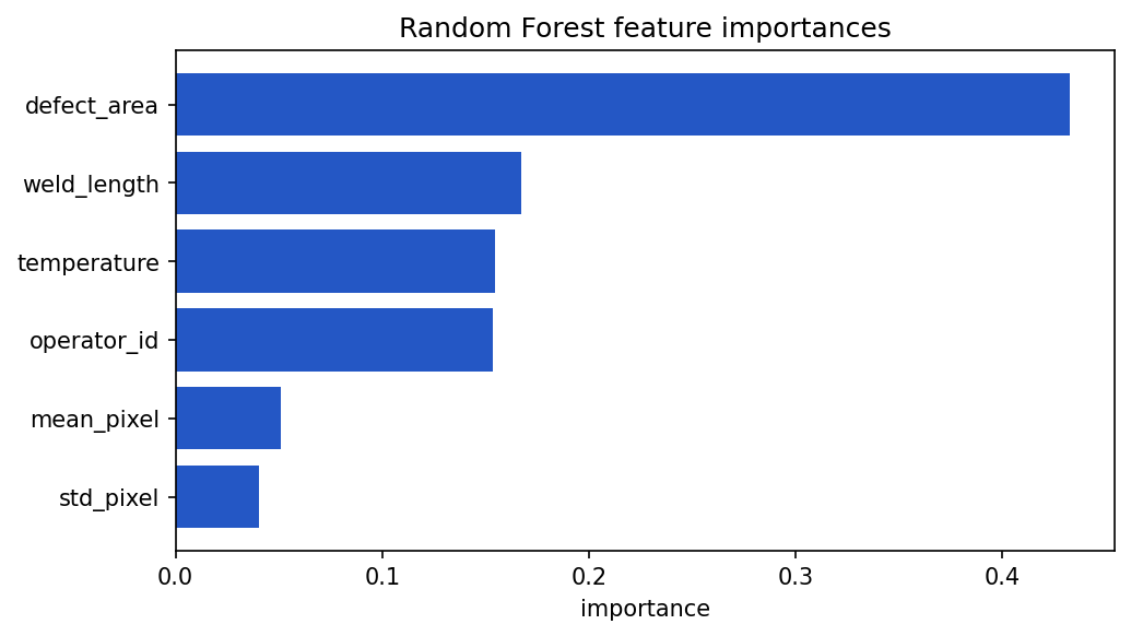
Show the code that generated this plot
import pandas as pd
import matplotlib.pyplot as plt
from sklearn.ensemble import RandomForestClassifier
from sklearn.datasets import make_classification

feature_names = ['mean_pixel', 'std_pixel', 'defect_area',
                 'weld_length', 'temperature', 'operator_id']
X, y = make_classification(n_samples=400, n_features=6, n_informative=3,
                           n_redundant=1, random_state=42)

model = RandomForestClassifier(random_state=42).fit(X, y)
imp = (pd.DataFrame({'feature': feature_names, 'importance': model.feature_importances_})
       .sort_values('importance'))

plt.barh(imp['feature'], imp['importance'], color='#2457c5')
plt.xlabel('importance')
plt.title('Random Forest feature importances')
plt.show()
Feature importance should be treated as evidence, not final truth. Some models give high importance to features with many possible values. Correlated features can also split importance between them.
Permutation importance
Permutation importance asks: How much worse does the model get if this feature is randomly shuffled?
from sklearn.inspection import permutation_importance

result = permutation_importance(
    model,
    X_test,
    y_test,
    n_repeats=10,
    random_state=42,
)

importance_df = pd.DataFrame({
    'feature': feature_names,
    'importance': result.importances_mean,
}).sort_values('importance', ascending=False)

print(importance_df)
If shuffling a feature hurts performance, the model was relying on that feature.
Dropping unimportant features
Dropping features can make a model simpler, faster, and easier to explain.
Reasons to drop a feature include:
- It is not available at prediction time.
- It duplicates another feature.
- It contains many missing values.
- It has the same value for almost every row.
- It appears unrelated to the label.
- It creates privacy, security, or compliance concerns.
- It makes the model less stable on new data.
For example:
columns_to_drop = [
    'database_row_id',
    'final_disposition_notes',
    'operator_birthdate',
]

X = df.drop(columns=columns_to_drop + ['defect_class'])
y = df['defect_class']
In this example, operator_birthdate might be dropped after creating operator_age. The original date may be more sensitive and less directly useful than the derived age feature.
The iterative nature of feature selection
Feature selection is rarely a one-time step. It is usually iterative.
A practical workflow:
- Start with a reasonable set of features.
- Train a baseline model.
- Measure performance with appropriate metrics.
- Inspect feature importance and model errors.
- Remove weak, duplicate, leaking, or impractical features.
- Add better derived features based on what you learned.
- Retrain and compare against the baseline.
- Repeat until changes stop helping or the model is simple enough.
Feature selection is not just about getting the highest score. It is also about building a model that can be trusted, maintained, and explained.
Communicating feature selection to stakeholders
Stakeholders may not care about every technical detail, but they do need to understand why certain inputs are used.
When explaining feature selection, focus on plain language:
- What problem are we trying to solve?
- Which inputs are used?
- Why are those inputs available and reliable?
- Which inputs were removed?
- Why were they removed?
- What tradeoffs did we accept?
- How did performance change?
Instead of saying:
We dropped collinear features after permutation importance showed low marginal utility.
You might say:
We removed duplicate measurements that were telling the model the same thing. The model became simpler, and test performance stayed about the same.
Defending feature selection decisions
To defend feature selection clearly, keep evidence.
Useful evidence includes:
- A list of selected features.
- A list of removed features.
- The reason each feature was removed.
- Before-and-after model performance.
- Feature importance plots or tables.
- Notes from domain experts.
- Known limitations.
For example:
| Feature | Decision | Reason |
|---|---|---|
weld_length_mm |
Keep | Physically meaningful and available before inspection |
database_row_id |
Drop | Identifier with no process meaning |
operator_birthdate |
Drop | Replaced with operator_age; reduces sensitivity |
final_disposition_notes |
Drop | Created after the outcome; leakage risk |
Good communication builds confidence. It also makes the project easier to audit later.
The curse of dimensionality
Dimensionality means the number of features.
If a dataset has 5 input columns, it has 5 dimensions. If it has 10,000 input columns, it has 10,000 dimensions.
The curse of dimensionality describes problems that appear when data has too many dimensions compared with the number of examples.
As dimensions increase:
- Data becomes sparse.
- Distances between points become less meaningful.
- Models may overfit.
- Training may become slower.
- More examples are needed to cover the feature space.
- Visualization becomes difficult.
For example, one-hot encoding a high-cardinality column can create thousands of columns. Image data can also have many dimensions. A 224 x 224 grayscale image has 50,176 pixel values before any additional features are added.
High dimensionality is not always bad. Sometimes many features are necessary. The risk is having many weak or noisy features without enough examples to support them.
Dimensionality reduction
Dimensionality reduction means representing data with fewer features while preserving useful information.
Dimensionality reduction can help with:
- Visualization.
- Noise reduction.
- Faster training.
- Compressing features.
- Finding structure in high-dimensional data.
It can also hide information, so it should be used thoughtfully.
PCA
Principal Component Analysis, or PCA, is a common dimensionality reduction method for numeric data.
PCA creates new features called principal components. These components are combinations of the original features. The first component captures as much variation as possible. The second captures the next most variation, and so on.
from sklearn.decomposition import PCA
from sklearn.preprocessing import StandardScaler

scaler = StandardScaler()
X_scaled = scaler.fit_transform(X)

pca = PCA(n_components=2)
X_pca = pca.fit_transform(X_scaled)

print(X_pca.shape)
print(pca.explained_variance_ratio_)
Output:
(100, 2)
[0.42 0.21]
In this example, the first two principal components explain about 63% of the variance.
PCA is useful when:
- Features are numeric.
- Features are correlated.
- You want a smaller set of components.
- You need a repeatable transformation for training and future data.
PCA has limitations:
- Components can be hard to explain.
- It captures linear patterns better than nonlinear ones.
- Scaling matters.
- A component is not the same as an original physical measurement.
t-SNE
t-SNE stands for t-distributed Stochastic Neighbor Embedding. It is often used to visualize high-dimensional data in two dimensions.
from sklearn.manifold import TSNE

tsne = TSNE(
    n_components=2,
    perplexity=30,
    random_state=42,
)

X_tsne = tsne.fit_transform(X_scaled)
print(X_tsne.shape)
t-SNE is useful for exploring whether examples form clusters. For example, weld images from different defect classes may group together.
t-SNE has limitations:
- It is mainly a visualization tool.
- Distances between far-apart clusters can be misleading.
- Results depend on parameters such as
perplexity. - It can be slow on large datasets.
- It does not naturally provide a simple transformation for future data in the same way PCA does.
Use t-SNE for exploration, not as the only proof that classes are separable.
Run on the same 10-dimensional data, PCA and t-SNE both reveal the three classes in 2D, but with different geometry — PCA preserves global structure, t-SNE emphasizes local clusters:
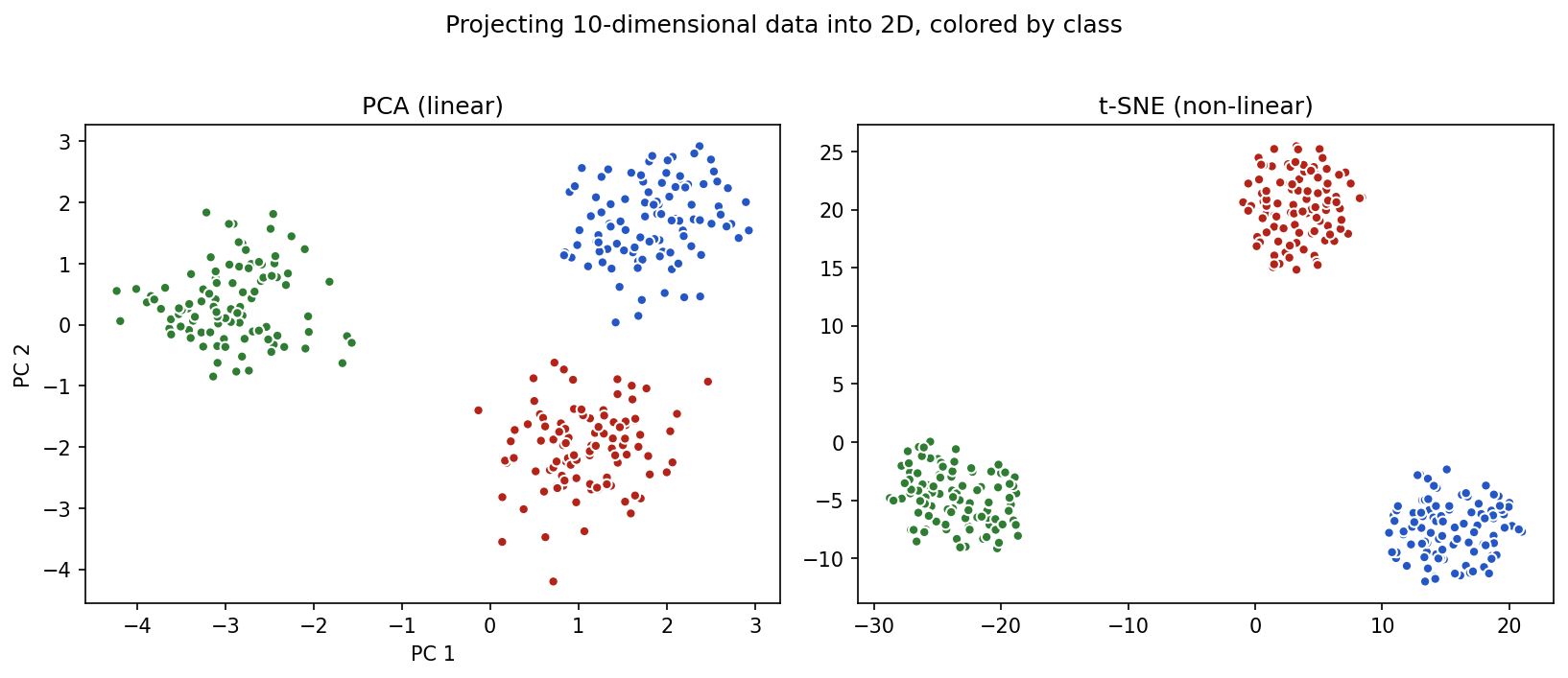
Show the code that generated this plot
import matplotlib.pyplot as plt
from sklearn.preprocessing import StandardScaler
from sklearn.decomposition import PCA
from sklearn.manifold import TSNE
from sklearn.datasets import make_blobs

X, y = make_blobs(n_samples=300, n_features=10, centers=3,
                  cluster_std=2.5, random_state=42)
X_scaled = StandardScaler().fit_transform(X)
X_pca = PCA(n_components=2).fit_transform(X_scaled)
X_tsne = TSNE(n_components=2, perplexity=30, random_state=42).fit_transform(X_scaled)

fig, (ax1, ax2) = plt.subplots(1, 2, figsize=(11, 4.6))
ax1.scatter(X_pca[:, 0], X_pca[:, 1], c=y, edgecolor='white', s=25)
ax1.set_title('PCA (linear)')
ax2.scatter(X_tsne[:, 0], X_tsne[:, 1], c=y, edgecolor='white', s=25)
ax2.set_title('t-SNE (non-linear)')
plt.show()
UMAP
UMAP stands for Uniform Manifold Approximation and Projection. Like t-SNE, it is often used for visualization, but it can also be useful for feature compression in some workflows.
import umap

reducer = umap.UMAP(
    n_components=2,
    random_state=42,
)

X_umap = reducer.fit_transform(X_scaled)
print(X_umap.shape)
UMAP is useful when:
- You want to visualize high-dimensional data.
- You want a method that is often faster than t-SNE.
- You want to preserve some local structure in the data.
- You want to transform future data after fitting the reducer.
UMAP has limitations:
- Results depend on parameters such as
n_neighborsandmin_dist. - Clusters in a plot can look more certain than they really are.
- It may require an extra package.
- It should still be validated with real model performance and domain review.
Comparing PCA, t-SNE, and UMAP
| Method | Common use | Strength | Caution |
|---|---|---|---|
| PCA | Compression and visualization | Fast, repeatable, good for linear structure | Components may be hard to explain |
| t-SNE | Visualization | Good at showing local clusters | Mainly exploratory; distances can mislead |
| UMAP | Visualization and some compression | Often fast; can preserve local structure | Parameter choices affect the plot |
Dimensionality reduction plots are helpful conversation starters. They are not final proof that a model will work.
A practical feature engineering workflow
When preparing a dataset for modeling, use a repeatable checklist.
- Identify the label. Know exactly what the model is trying to predict.
- Separate feature types. Mark categorical, continuous, date/time, image, and text fields.
- Check availability. Remove fields that would not be available at prediction time.
- Create derived features. Calculate useful values such as age, duration, area, ratios, or pixel summaries.
- Encode categories. Use one-hot encoding for nominal categories and ordered mappings for true ordinal categories.
- Scale numeric values. Use min-max, standard, or robust scaling when appropriate.
- Fix shape and label format. Make sure
Xandymatch what the model expects. - Split the data. Create train, validation, and test sets before fitting transformations.
- Rebalance training data. Use collection, oversampling, undersampling, synthetic examples, class weights, or threshold tuning when needed.
- Select features. Keep useful, available, explainable features and drop weak or risky ones.
- Evaluate and iterate. Compare each feature change against a baseline.
- Document decisions. Record what changed and why.
Common mistakes
Here are a few traps to avoid:
- Encoding categories as numbers when there is no order. This can create a fake ranking.
- Scaling before splitting the data. This can leak test-set information into training.
- Balancing the test set. The test set should reflect the real world.
- Keeping leakage features. A model that sees the answer in disguise will not be useful in production.
- Creating too many weak features. More columns do not automatically mean more information.
- Dropping features only because one model ranked them low. Check stability, domain meaning, and error patterns.
- Trusting a t-SNE or UMAP plot too much. A nice-looking cluster plot is not the same as a validated model.
- Forgetting to document feature decisions. Future users need to understand why the model uses certain inputs.
Summary
Feature engineering prepares raw data for modeling. Categorical variables describe groups and may be nominal, ordinal, binary, or multi-label. Continuous variables are numeric measurements and may include interval values, ratio values, counts, and time-based fields.
Useful features can be created from existing fields, such as calculating age from birthdate, duration from timestamps, area from width and height, or pixel summaries from images. Categorical data can be converted to one-hot encoded columns. Numeric data can be scaled with methods such as min-max scaling, standard scaling, and robust scaling.
Models also require the correct size, shape, and label type. Rebalancing strategies such as collecting more data, oversampling, undersampling, synthetic examples, class weights, and threshold adjustment can help with imbalanced classes, but each has tradeoffs.
Feature selection is iterative. Important features should be identified using domain knowledge, model evidence, error analysis, and stakeholder review. Unimportant or risky features should be dropped when doing so improves simplicity, reliability, or explainability.
High-dimensional data can create problems known as the curse of dimensionality. PCA, t-SNE, and UMAP can reduce dimensionality or help visualize structure, but their results should be interpreted carefully.
| Topic | Key ideas |
|---|---|
| Categorical variables | Represent groups; include nominal, ordinal, binary, and multi-label data |
| Continuous variables | Numeric measurements; include interval, ratio, count, and time-based data |
| Derived features | Create useful inputs such as age, duration, area, ratio, and pixel summaries |
| One-hot encoding | Converts nominal categories into numeric columns |
| Scaling | Puts numeric values into comparable ranges |
| Shape and label type | Models expect specific input shapes and target formats |
| Class rebalancing | Handles uneven class counts using several strategies with tradeoffs |
| Feature importance | Helps identify useful, weak, duplicate, or risky inputs |
| Feature selection | Iterative process of keeping useful features and dropping unhelpful ones |
| Stakeholder communication | Explains selected and removed features in plain language |
| Curse of dimensionality | Too many dimensions can cause sparsity, overfitting, and slow training |
| PCA | Reduces numeric features into principal components |
| t-SNE | Exploratory visualization of high-dimensional data |
| UMAP | Visualization and possible compression of high-dimensional data |
Practice Questions
Practice Questions
- In your own words, what is feature engineering?
- What is the difference between a feature and a label?
- What is the difference between categorical and continuous variables?
- Give one example of a nominal categorical variable.
- Give one example of an ordinal categorical variable.
- Why can it be misleading to encode nominal categories as
1,2, and3? - What is a binary categorical variable?
- What is a multi-label problem?
- Give one example of a ratio variable.
- Why might a raw birthdate be converted into age?
- Write pandas code that calculates
defect_areafromdefect_widthanddefect_height. - What does one-hot encoding do?
- Use pandas to one-hot encode a column named
material. - Why do some models need numeric features to be scaled?
- What is the difference between min-max scaling and standard scaling?
- Why should a scaler be fit only on the training data?
- For scikit-learn, what shape should
Xusually have? - If a one-feature NumPy array has shape
(100,), how can you reshape it to(100, 1)? - Why should class imbalance be checked before training?
- Name three strategies for handling imbalanced classes.
- What is one advantage and one disadvantage of oversampling?
- What is one advantage and one disadvantage of undersampling?
- Why should rebalancing usually be applied only to the training set?
- Name two reasons to drop a feature.
- What is data leakage?
- Why is feature selection an iterative process?
- How would you explain to a non-technical stakeholder why a feature was removed?
- What is the curse of dimensionality?
- What does PCA do?
- Why should t-SNE and UMAP plots be interpreted carefully?