Chapter - Dataset Statistics and Visualization
Supplementary chapter prepared for the BWXT Data Science Workforce Training Pilot. This material is original to the program and is not derived from Automate the Boring Stuff with Python; it is written in a similar tone for continuity with the other chapters.
About this chapter
So far, you have learned how to write Python scripts, organize data in lists and dictionaries, load files, and think about programs as a series of steps. Those are the building blocks you need for one of the most important habits in data science: look at the data before you trust it.
This chapter introduces practical dataset statistics and visualization. You will learn how to count examples by class, summarize numeric values, inspect image pixel values, plot distributions, and use graphs to spot patterns or outliers. You will also meet a few important statistical ideas that show up often in machine learning: the sigmoid function, the Gaussian or normal curve, and skew.
The examples use manufacturing and welding language, but the same ideas apply to almost any dataset: inspection images, sensor readings, spreadsheet rows, quality results, or defect labels.
Why summarize a dataset?
A dataset can look fine at first glance and still contain problems that will hurt your analysis or model.
For example:
- One defect class may have 500 examples, while another has only 12.
- Some images may be nearly black because the exposure was wrong.
- A few pixel values may be strange because an image was saved with the wrong bit depth.
- One sensor column may have an impossible value, like a negative exposure time.
- A model may appear accurate only because most examples belong to the same class.
Summary statistics and graphs help you catch these problems early. They do not replace domain knowledge, but they give you a fast way to ask: Does this dataset behave the way I expected?
What are summary statistics?
Summary statistics are small numbers that describe a larger collection of values.
If you have a list of weld image brightness values, you might ask:
- How many values are there?
- What is the smallest value?
- What is the largest value?
- What is the average?
- What is the median?
- How spread out are the values?
In Python, a small list can be summarized by hand:
brightness_values = [42, 45, 44, 41, 250, 43, 46]

count = len(brightness_values)
minimum = min(brightness_values)
maximum = max(brightness_values)
average = sum(brightness_values) / count

print(count)
print(minimum)
print(maximum)
print(average)
Output:
7
41
250
79.0
The average is 79.0, but most of the values are in the low 40s. The value 250 is pulling the average upward. That one number might be a real bright image, or it might be an outlier worth checking.
The usual statistics vocabulary
You will see these terms often:
| Statistic | Meaning | Welding dataset example |
|---|---|---|
| Count | How many values or rows there are | Number of images |
| Minimum | The smallest value | Darkest pixel value |
| Maximum | The largest value | Brightest pixel value |
| Mean | The arithmetic average | Average image brightness |
| Median | The middle value after sorting | Typical weld length |
| Standard deviation | How spread out values are | Variation in image brightness |
| Percentile | Value below which a percentage of data falls | 95th percentile defect area |
| Class count | Number of examples in each category | Number of porosity vs. crack labels |
The mean and median are both useful, but they answer different questions. The mean is sensitive to extreme values. The median is more resistant to outliers.
values = [41, 42, 43, 44, 45, 46, 250]

mean_value = sum(values) / len(values)
median_value = sorted(values)[len(values) // 2]

print(mean_value)    # 73.0
print(median_value)  # 44
If you want to know what value is typical, the median may tell a better story here.
Using pandas for tabular summaries
For real datasets, you will usually store metadata in a table: one row per image, annotation, weld, or sensor reading.
Here is a small example:
import pandas as pd

records = [
    {'image_id': 'img_001.png', 'defect_class': 'porosity', 'mean_pixel': 82.4},
    {'image_id': 'img_002.png', 'defect_class': 'crack', 'mean_pixel': 91.2},
    {'image_id': 'img_003.png', 'defect_class': 'porosity', 'mean_pixel': 77.8},
    {'image_id': 'img_004.png', 'defect_class': 'undercut', 'mean_pixel': 65.1},
]

df = pd.DataFrame(records)
print(df)
Output:
      image_id defect_class  mean_pixel
0  img_001.png     porosity        82.4
1  img_002.png        crack        91.2
2  img_003.png     porosity        77.8
3  img_004.png     undercut        65.1
The describe() method gives a quick numeric summary:
print(df['mean_pixel'].describe())Output:
count     4.000000
mean     79.125000
std      10.882746
min      65.100000
25%      74.625000
50%      80.100000
75%      84.600000
max      91.200000
Name: mean_pixel, dtype: float64
This one command gives you count, mean, standard deviation, minimum, maximum, and quartiles.
Creating class counts
For classification datasets, one of the first checks is class balance: how many examples belong to each class?
class_counts = df['defect_class'].value_counts()
print(class_counts)
Output:
porosity    2
crack       1
undercut    1
Name: defect_class, dtype: int64
You can also turn those counts into percentages:
class_percentages = df['defect_class'].value_counts(normalize=True) * 100
print(class_percentages)
Output:
porosity    50.0
crack       25.0
undercut    25.0
Name: defect_class, dtype: float64
Class counts matter because models learn from examples. If 95% of your images are labeled no_defect, a model can look impressive by guessing no_defect all the time. The accuracy might be high, but the model may fail exactly where you need it most: finding rare defects.
Class counts from folders
Many image classification datasets are organized with one folder per class:
dataset/
    crack/
        img_001.png
        img_002.png
    porosity/
        img_003.png
    no_defect/
        img_004.png
        img_005.png
        img_006.png
You can count files in each folder with pathlib:
from pathlib import Path

dataset_dir = Path('dataset')

class_counts = {}
for class_dir in dataset_dir.iterdir():
    if class_dir.is_dir():
        image_files = list(class_dir.glob('*.png'))
        class_counts[class_dir.name] = len(image_files)

print(class_counts)
Output:
{'crack': 2, 'porosity': 1, 'no_defect': 3}If your dataset uses .jpg or .jpeg, include those too:
image_files = (
    list(class_dir.glob('*.png'))
    + list(class_dir.glob('*.jpg'))
    + list(class_dir.glob('*.jpeg'))
)
Pixel values in images
Digital images are grids of numbers. Each number is a pixel value.
For an 8-bit grayscale image:
0usually means black.255usually means white.- Values between
0and255are shades of gray.
For a color image, each pixel often has three channels:
- Red
- Green
- Blue
In Python, images are commonly loaded as NumPy arrays. A grayscale image might have shape (height, width). A color image might have shape (height, width, 3).
from PIL import Image
import numpy as np

image = Image.open('weld_xray.png').convert('L')  # L means grayscale
pixels = np.array(image)

print(pixels.shape)
print(pixels.min())
print(pixels.max())
print(pixels.mean())
Output:
(512, 512)
0
255
87.3
The exact output will depend on your image. The important point is that an image is not mysterious to Python. It is an array of numbers.
Summarizing pixel values for one image
For one image, useful pixel summaries include:
- Minimum pixel value
- Maximum pixel value
- Mean pixel value
- Median pixel value
- Standard deviation
- Percentiles
summary = {
    'min': pixels.min(),
    'max': pixels.max(),
    'mean': pixels.mean(),
    'median': np.median(pixels),
    'std': pixels.std(),
    'p01': np.percentile(pixels, 1),
    'p99': np.percentile(pixels, 99),
}

print(summary)
Output:
{'min': 0, 'max': 255, 'mean': 87.3, 'median': 82.0, 'std': 31.8, 'p01': 12.0, 'p99': 179.0}The 1st and 99th percentiles are often more useful than the exact minimum and maximum. A single bad pixel can make the minimum or maximum look extreme, but percentiles tell you what most of the image is doing.
Summarizing pixel values for many images
For a dataset, you can loop through image files and collect one summary row per image:
from pathlib import Path
from PIL import Image
import numpy as np
import pandas as pd

image_dir = Path('weld_images')
rows = []

for image_path in image_dir.glob('*.png'):
    image = Image.open(image_path).convert('L')
    pixels = np.array(image)

    rows.append({
        'image_id': image_path.name,
        'height': pixels.shape[0],
        'width': pixels.shape[1],
        'min_pixel': pixels.min(),
        'max_pixel': pixels.max(),
        'mean_pixel': pixels.mean(),
        'median_pixel': np.median(pixels),
        'std_pixel': pixels.std(),
    })

pixel_df = pd.DataFrame(rows)
print(pixel_df.head())
Once you have a table, you can ask familiar questions:
print(pixel_df[['mean_pixel', 'std_pixel']].describe())This is a common pattern in data science:
- Load raw files.
- Extract useful measurements.
- Put the measurements into a table.
- Summarize and visualize the table.
Pixel distributions
A distribution shows how often different values occur.
For a grayscale image, the pixel distribution answers: How many pixels are dark? How many are medium gray? How many are bright?
The most common graph for a distribution is a histogram.
Show the code that generated this plot
import numpy as np
import matplotlib.pyplot as plt

# A synthetic 512x512 grayscale image (stand-in for a real weld image)
rng = np.random.default_rng(0)
pixels = np.clip(rng.normal(80, 25, size=(512, 512)), 0, 255).astype('uint8')

plt.hist(pixels.ravel(), bins=50)
plt.title('Pixel Value Distribution')
plt.xlabel('Pixel value')
plt.ylabel('Number of pixels')
plt.show()
The .ravel() method flattens the 2D image into one long list of pixel values. A 512 x 512 image becomes 262,144 values.
What to look for in a pixel histogram
A pixel histogram can reveal:
- Underexposure: most pixels are near
0. - Overexposure: many pixels are near
255. - Low contrast: values are squeezed into a narrow range.
- High contrast: values spread widely from dark to bright.
- Clipping: unusually large spikes at
0or255.
For welding inspection images, this can help identify inconsistent imaging conditions before you train a model.
Plotting class counts
Numbers are useful, but graphs are often easier to understand quickly.
Use a bar chart for class counts:
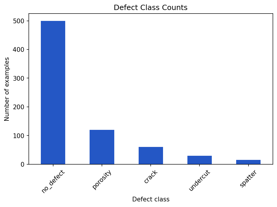
no_defect bar makes the class imbalance impossible to miss.Show the code that generated this plot
import pandas as pd
import matplotlib.pyplot as plt

# Defect labels for a batch of inspection images
labels = (['no_defect'] * 500 + ['porosity'] * 120
          + ['crack'] * 60 + ['undercut'] * 30 + ['spatter'] * 15)
class_counts = pd.Series(labels).value_counts()

class_counts.plot(kind='bar')
plt.title('Defect Class Counts')
plt.xlabel('Defect class')
plt.ylabel('Number of examples')
plt.xticks(rotation=45)
plt.tight_layout()
plt.show()
A bar chart makes class imbalance obvious. If one bar towers over all the others, you should stop and think before training a model.
Plotting numeric distributions
Use a histogram when you want to see the distribution of one numeric variable.
Show the code that generated this plot
import numpy as np
import pandas as pd
import matplotlib.pyplot as plt
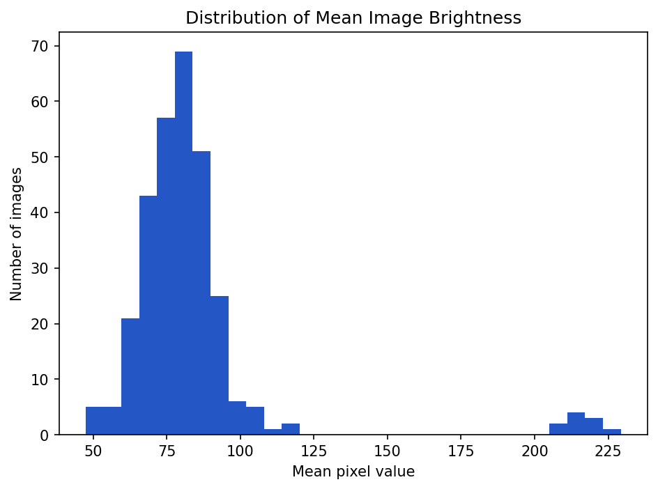
# Mean brightness for ~300 images: most cluster near 80, a few are very bright
rng = np.random.default_rng(1)
mean_pixel = np.concatenate([rng.normal(80, 12, 290), rng.normal(215, 8, 10)])
pixel_df = pd.DataFrame({'mean_pixel': mean_pixel})
pixel_df['mean_pixel'].plot(kind='hist', bins=30)
plt.title('Distribution of Mean Image Brightness')
plt.xlabel('Mean pixel value')
plt.ylabel('Number of images')
plt.show()If most images cluster around a mean pixel value of 80, but a few are near 220, those bright images may deserve inspection.
Box plots for spotting outliers
A box plot summarizes a distribution using quartiles and highlights potential outliers.
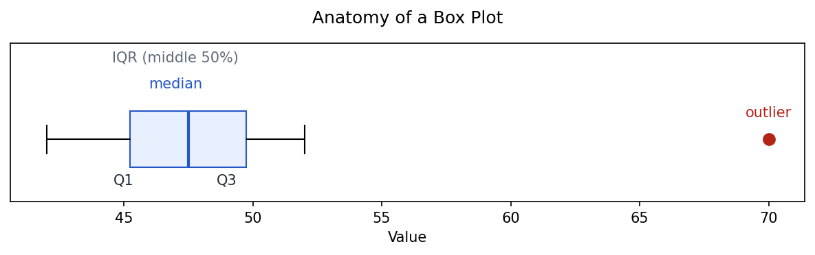
Show the code that generated this plot
import numpy as np
import matplotlib.pyplot as plt

# A small sample whose largest value sits far above the rest (an outlier)
data = [42, 44, 45, 46, 47, 48, 49, 50, 52, 70]

fig, ax = plt.subplots(figsize=(8, 2.6))
ax.boxplot(
    data,
    vert=False,
    widths=0.5,
    patch_artist=True,
    boxprops=dict(facecolor='#e8efff', edgecolor='#2457c5'),
    medianprops=dict(color='#2457c5', linewidth=2),
    flierprops=dict(marker='o', markerfacecolor='#b42318',
                    markeredgecolor='#b42318', markersize=8),
)

q1, med, q3 = np.percentile(data[:-1], [25, 50, 75])
ax.set_ylim(0.45, 1.85)
ax.annotate('median', xy=(med, 1.45), ha='center', color='#2457c5')
ax.annotate('IQR (middle 50%)', xy=((q1 + q3) / 2, 1.68), ha='center', color='#5f6b7a')
ax.annotate('Q1', xy=(q1, 0.6), ha='center')
ax.annotate('Q3', xy=(q3, 0.6), ha='center')
ax.annotate('outlier', xy=(70, 1.2), ha='center', color='#b42318')
ax.set_title('Anatomy of a Box Plot', pad=14)
ax.set_yticks([])
ax.set_xlabel('Value')
plt.show()
A box plot of a real column shows the same anatomy on your own data:
Show the code that generated this plot
import numpy as np
import pandas as pd
import matplotlib.pyplot as plt

rng = np.random.default_rng(1)
mean_pixel = np.concatenate([rng.normal(80, 12, 290), rng.normal(215, 8, 10)])
pixel_df = pd.DataFrame({'mean_pixel': mean_pixel})

pixel_df.boxplot(column='mean_pixel')
plt.title('Mean Pixel Value Box Plot')
plt.ylabel('Mean pixel value')
plt.show()
You can also compare groups:
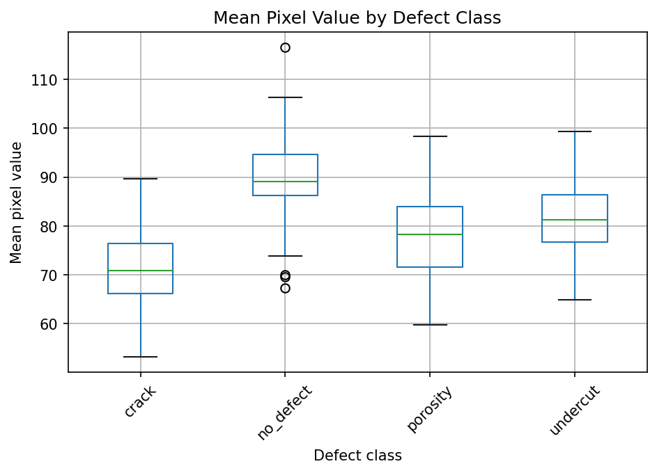
Show the code that generated this plot
import numpy as np
import pandas as pd
import matplotlib.pyplot as plt

rng = np.random.default_rng(3)
centers = {'no_defect': 90, 'porosity': 78, 'crack': 70, 'undercut': 82}
rows = []
for cls, center in centers.items():
    for value in rng.normal(center, 8, 60):
        rows.append({'mean_pixel': value, 'defect_class': cls})
df = pd.DataFrame(rows)

df.boxplot(column='mean_pixel', by='defect_class')
plt.title('Mean Pixel Value by Defect Class')
plt.suptitle('')
plt.xlabel('Defect class')
plt.ylabel('Mean pixel value')
plt.xticks(rotation=45)
plt.show()
This can help answer questions like: Are crack images consistently darker than no-defect images? If the answer is yes, your model might learn lighting conditions instead of learning defects.
Scatter plots for relationships
A scatter plot shows the relationship between two numeric variables.
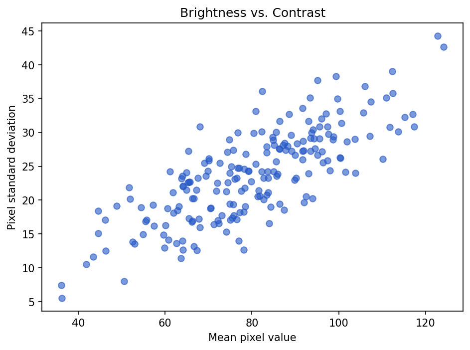
Show the code that generated this plot
import numpy as np
import pandas as pd
import matplotlib.pyplot as plt

# Brightness and contrast for 200 images (contrast rises with brightness)
rng = np.random.default_rng(2)
mean_pixel = rng.normal(80, 18, 200)
std_pixel = 0.3 * mean_pixel + rng.normal(0, 4, 200)
pixel_df = pd.DataFrame({'mean_pixel': mean_pixel, 'std_pixel': std_pixel})

plt.scatter(pixel_df['mean_pixel'], pixel_df['std_pixel'], alpha=0.6)
plt.title('Brightness vs. Contrast')
plt.xlabel('Mean pixel value')
plt.ylabel('Pixel standard deviation')
plt.show()
Each point is one image. Points far away from the rest may be unusual examples. They are not automatically bad, but they are worth checking.
Scatter plots are useful for questions like:
- Do brighter images also have higher contrast?
- Are larger defects easier to detect?
- Does exposure time relate to image brightness?
- Do certain sensors produce different value ranges?
Line charts for trends
Use a line chart when the order matters, especially over time.
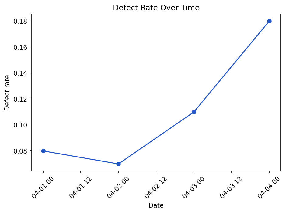
Show the code that generated this plot
import pandas as pd
import matplotlib.pyplot as plt

inspection_df = pd.DataFrame([
    {'date': '2026-04-01', 'defect_rate': 0.08},
    {'date': '2026-04-02', 'defect_rate': 0.07},
    {'date': '2026-04-03', 'defect_rate': 0.11},
    {'date': '2026-04-04', 'defect_rate': 0.18},
])

inspection_df['date'] = pd.to_datetime(inspection_df['date'])

plt.plot(inspection_df['date'], inspection_df['defect_rate'], marker='o')
plt.title('Defect Rate Over Time')
plt.xlabel('Date')
plt.ylabel('Defect rate')
plt.xticks(rotation=45)
plt.tight_layout()
plt.show()
Line charts are good for seeing drift, process changes, or sudden jumps.
Choosing the right chart
Different questions call for different charts.
| Question | Good chart |
|---|---|
| How many examples are in each class? | Bar chart |
| What does one numeric distribution look like? | Histogram |
| Are there outliers? | Box plot |
| How do two numeric variables relate? | Scatter plot |
| How does something change over time? | Line chart |
| How are pixel values distributed in an image? | Histogram |
The chart is not the goal. The goal is understanding. A simple chart that answers the question is better than a fancy chart that hides it.
Outliers: mistakes or important examples?
An outlier is a value far away from the rest of the data.
Outliers can be caused by:
- Data entry errors
- Corrupt files
- Different measurement settings
- Rare but valid conditions
- Actual process problems
Suppose one image has a mean pixel value of 252, while almost all others are between 60 and 110. That image might be overexposed. Or it might show a very bright part. You should inspect it before deleting it.
bright_images = pixel_df[pixel_df['mean_pixel'] > 220]
print(bright_images)
A good workflow is:
- Use statistics to find unusual rows.
- Use graphs to understand the pattern.
- Open a few examples.
- Decide whether they are errors, rare valid cases, or useful signals.
Normalizing pixel values
Many machine learning workflows convert pixel values from 0-255 into a smaller range, often 0-1.
pixels_float = pixels.astype('float32') / 255.0

print(pixels_float.min())
print(pixels_float.max())
Output:
0.0
1.0
This is called normalization, but be careful: it is not the same thing as a normal distribution. The word "normal" appears in both places, but the meanings are different.
The normal distribution
A normal distribution is the famous bell-shaped curve.
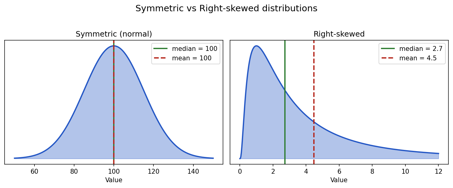
Show the code that generated this plot
import numpy as np
import matplotlib.pyplot as plt
from scipy import stats

fig, (ax1, ax2) = plt.subplots(1, 2, figsize=(10, 4))

# Symmetric (normal): mean == median
x_norm = np.linspace(50, 150, 400)
pdf_norm = stats.norm.pdf(x_norm, loc=100, scale=15)
ax1.fill_between(x_norm, pdf_norm, alpha=0.35, color='#2457c5')
ax1.plot(x_norm, pdf_norm, color='#2457c5', linewidth=2)
ax1.axvline(100, color='#2f7d32', linewidth=2, label='median = 100')
ax1.axvline(100, color='#b42318', linewidth=2, linestyle='--', label='mean = 100')
ax1.set_title('Symmetric (normal)')
ax1.legend()
ax1.set_yticks([])

# Right-skewed (log-normal): mean > median
x_skew = np.linspace(0, 12, 400)
dist = stats.lognorm(s=1.0, scale=np.exp(1))
ax2.fill_between(x_skew, dist.pdf(x_skew), alpha=0.35, color='#2457c5')
ax2.plot(x_skew, dist.pdf(x_skew), color='#2457c5', linewidth=2)
ax2.axvline(dist.median(), color='#2f7d32', linewidth=2, label=f'median = {dist.median():.1f}')
ax2.axvline(dist.mean(),   color='#b42318', linewidth=2, linestyle='--', label=f'mean = {dist.mean():.1f}')
ax2.set_title('Right-skewed')
ax2.legend()
ax2.set_yticks([])

plt.tight_layout()
plt.show()
It has a few important properties:
- Most values are near the center.
- Fewer values appear as you move away from the center.
- The left and right sides are symmetric.
- The mean, median, and peak are all in the same place.
Many real-world measurements are approximately normal, especially when they are influenced by many small independent factors. For example, small variation in a repeated measurement may look roughly normal.
Here is what 1,000 normal-looking values look like when you generate them and plot them with seaborn:
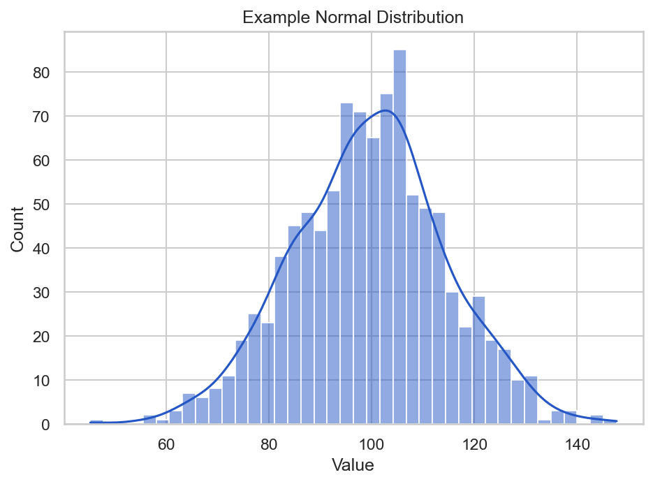
Show the code that generated this plot
import numpy as np
import seaborn as sns
import matplotlib.pyplot as plt

rng = np.random.default_rng(42)
values = rng.normal(loc=100, scale=15, size=1000)

sns.set_theme(style='whitegrid')
ax = sns.histplot(values, bins=40, kde=True, color='#2457c5')
ax.set_title('Example Normal Distribution')
ax.set_xlabel('Value')
ax.set_ylabel('Count')
plt.show()
In this example:
loc=100sets the center, or mean.scale=15sets the standard deviation.size=1000creates 1,000 values.kde=Trueoverlays seaborn's smooth density estimate on top of the histogram bars.
Gaussian and normal: two names, related idea
You will often hear Gaussian distribution and normal distribution used almost interchangeably. In introductory data science, they usually refer to the same bell-shaped curve.
The Gaussian function has this general shape:
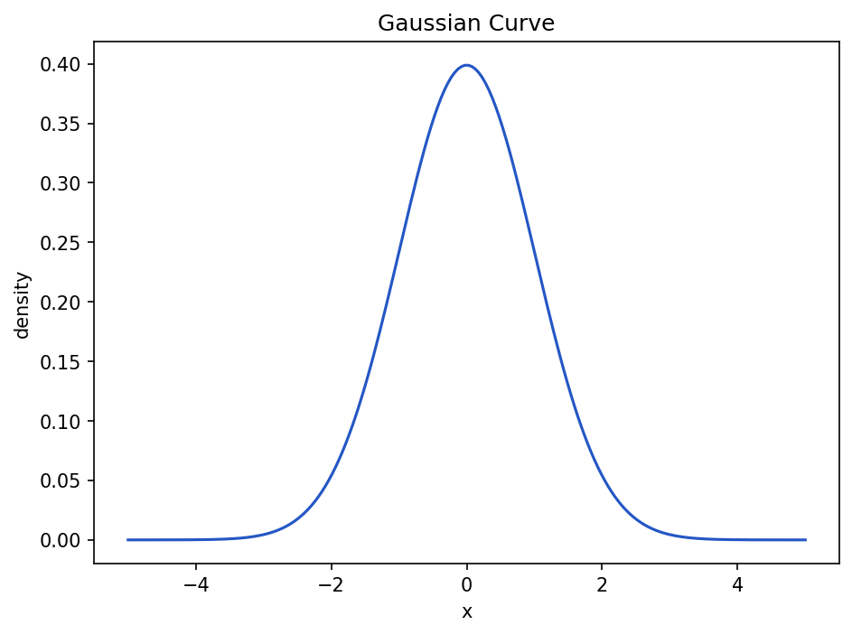
Show the code that generated this plot
import numpy as np
import matplotlib.pyplot as plt

x = np.linspace(-5, 5, 200)
mean = 0
std = 1

y = (1 / (std * np.sqrt(2 * np.pi))) * np.exp(-0.5 * ((x - mean) / std) ** 2)

plt.plot(x, y)
plt.title('Gaussian Curve')
plt.xlabel('x')
plt.ylabel('density')
plt.show()
You do not need to memorize the formula right away. The key idea is that a Gaussian curve is highest near the mean and falls off smoothly as you move away.
Why Gaussian curves matter
Gaussian curves show up in data science because they help us reason about variation.
They are useful for:
- Modeling measurement noise
- Understanding standard deviation
- Detecting unusually high or low values
- Building intuition for probability
- Understanding some machine learning algorithms
If a measurement is normally distributed, a value far from the mean may be rare. That does not always mean it is wrong, but it does mean it deserves attention.
The sigmoid function
The sigmoid function is an S-shaped curve that turns any real number into a value between 0 and 1.
It is often written like this:
sigmoid(x) = 1 / (1 + e^(-x))In Python:
import numpy as np

def sigmoid(x):
    return 1 / (1 + np.exp(-x))
Plot it:
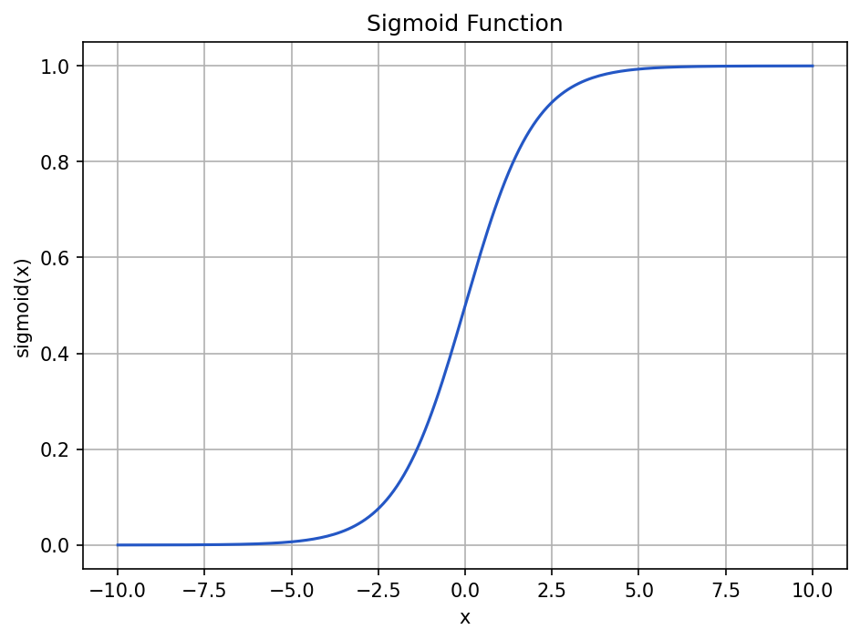
Show the code that generated this plot
import numpy as np
import matplotlib.pyplot as plt

def sigmoid(x):
    return 1 / (1 + np.exp(-x))

x = np.linspace(-10, 10, 200)
y = sigmoid(x)

plt.plot(x, y)
plt.title('Sigmoid Function')
plt.xlabel('x')
plt.ylabel('sigmoid(x)')
plt.grid(True)
plt.show()
The sigmoid function has three important behaviors:
- Large negative inputs become values close to
0. - An input of
0becomes0.5. - Large positive inputs become values close to
1.
That makes sigmoid useful when you want to convert a raw score into something that behaves like a probability.
For example, a simple model might output a raw score for whether an image contains a defect:
raw_score = 2.2
probability = sigmoid(raw_score)

print(probability)
Output:
0.9002495108803148The raw score 2.2 becomes about 0.90, which can be interpreted as a high confidence value in some binary classification settings.
Skew
Skew describes whether a distribution leans more heavily to one side.
A symmetric distribution has roughly equal left and right sides. A skewed distribution has a longer tail on one side.
| Type of distribution | What it looks like | Example |
|---|---|---|
| Symmetric | Left and right sides are similar | Normal measurement noise |
| Right-skewed | Long tail to the right | Most defects are small, a few are very large |
| Left-skewed | Long tail to the left | Most images are bright, a few are very dark |
Right-skewed data is common in defect datasets. Many defects may be small, while a few are very large.
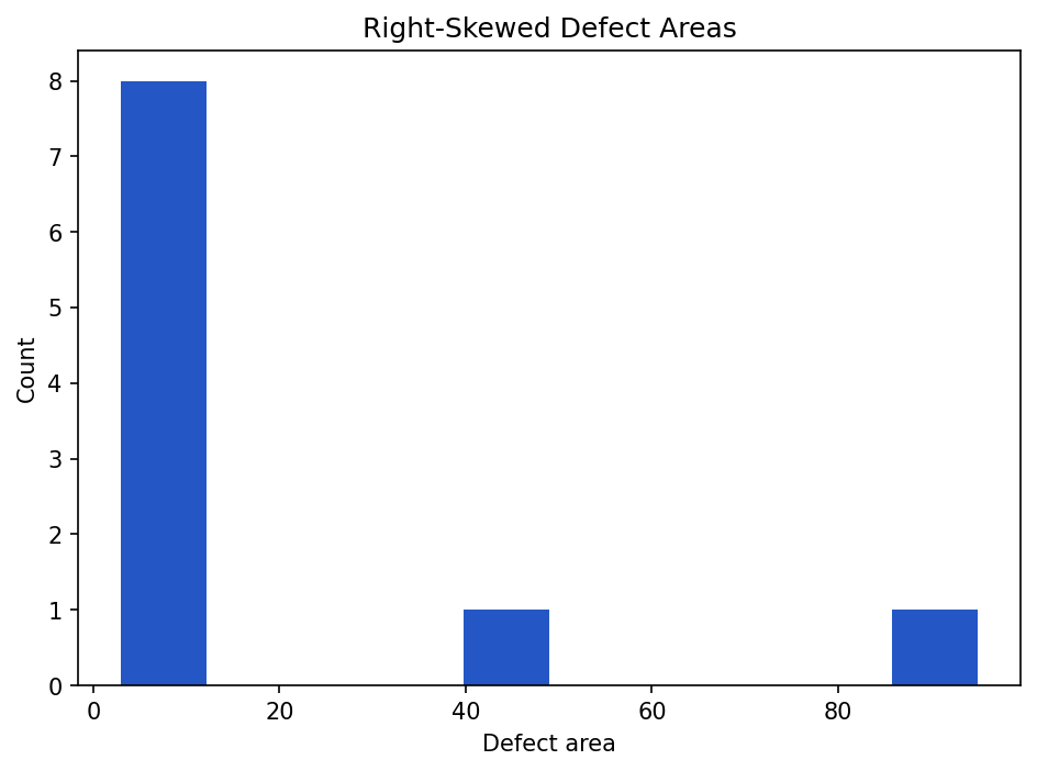
Show the code that generated this plot
import matplotlib.pyplot as plt

defect_areas = [3, 4, 4, 5, 6, 7, 8, 10, 40, 95]

plt.hist(defect_areas, bins=10)
plt.title('Right-Skewed Defect Areas')
plt.xlabel('Defect area')
plt.ylabel('Count')
plt.show()
The large values 40 and 95 stretch the distribution to the right.
Mean vs. median with skew
Skew affects the mean more than the median.
import numpy as np

defect_areas = np.array([3, 4, 4, 5, 6, 7, 8, 10, 40, 95])

print(defect_areas.mean())
print(np.median(defect_areas))
Output:
18.2
6.5
The mean is 18.2, but most values are much smaller. The median 6.5 better describes a typical defect in this example.
Calculating skew in pandas
Pandas can calculate skew directly:
print(pixel_df['mean_pixel'].skew())A rough interpretation:
| Skew value | Interpretation |
|---|---|
Near 0 |
Roughly symmetric |
| Positive | Right-skewed |
| Negative | Left-skewed |
Do not treat these as magic pass/fail rules. Skew is a clue. You still need to look at the histogram and understand the data.
A practical dataset-checking workflow
When you receive a new dataset, use a repeatable checklist.
- Count rows and files. Make sure the number of files matches what you expected.
- Count classes. Check whether one label dominates the dataset.
- Check missing values. Look for blank labels, missing paths, or missing measurements.
- Summarize numeric columns. Use
describe()on columns like exposure time, defect area, or mean pixel value. - Summarize image shapes. Check whether all images have the same height, width, and channels.
- Summarize pixel values. Look at min, max, mean, median, standard deviation, and percentiles.
- Plot distributions. Use histograms and box plots to find unusual values.
- Open examples. Always inspect a few real images, especially outliers.
- Write down findings. Keep notes so another person can understand what you checked.
Here is a small starter function that summarizes an image folder:
from pathlib import Path
from PIL import Image
import numpy as np
import pandas as pd

def summarize_image_folder(image_dir):
    rows = []
    image_dir = Path(image_dir)

    for image_path in image_dir.glob('*.png'):
        image = Image.open(image_path).convert('L')
        pixels = np.array(image)

        rows.append({
            'image_id': image_path.name,
            'height': pixels.shape[0],
            'width': pixels.shape[1],
            'min_pixel': pixels.min(),
            'max_pixel': pixels.max(),
            'mean_pixel': pixels.mean(),
            'median_pixel': np.median(pixels),
            'std_pixel': pixels.std(),
            'p01_pixel': np.percentile(pixels, 1),
            'p99_pixel': np.percentile(pixels, 99),
        })

    return pd.DataFrame(rows)


summary_df = summarize_image_folder('weld_images')
print(summary_df.describe())
This function does not know anything about welding by itself. It simply creates measurements that help you ask better welding questions.
Common mistakes
Here are a few traps to avoid:
- Only looking at averages. Averages can hide skew, outliers, and class imbalance.
- Ignoring class counts. A model trained on badly imbalanced classes may miss rare defects.
- Deleting outliers too quickly. Some outliers are mistakes, but others are important real cases.
- Confusing normalization with normal distribution. Scaling values to
0-1is not the same as making them bell-shaped. - Trusting one graph. Use several views: counts, histograms, box plots, scatter plots, and actual examples.
- Forgetting units. A column named
areais not enough. Is it pixels, square millimeters, or something else?
Summary
Dataset statistics and visualization help you understand what is in your data before you build conclusions or train models. Class counts reveal balance problems. Pixel summaries reveal exposure, contrast, and file issues. Histograms, bar charts, box plots, scatter plots, and line charts turn long columns of numbers into patterns you can see.
The sigmoid function maps any number into the range 0 to 1, which makes it useful for probability-like outputs. Gaussian and normal distributions describe the familiar bell-shaped curve, where most values are near the mean and fewer values appear farther away. Skew tells you when a distribution leans left or right, which affects how you interpret the mean and median.
| Topic | Key ideas |
|---|---|
| Class counts | Count examples by label; watch for imbalance |
| Pixel values | Images are arrays of numbers; summarize min, max, mean, median, std, and percentiles |
| Pixel distribution | Histogram of pixel values; useful for exposure and contrast checks |
| Bar chart | Good for category counts |
| Histogram | Good for one numeric distribution |
| Box plot | Good for outliers and group comparisons |
| Scatter plot | Good for relationships between two numeric variables |
| Line chart | Good for trends over time |
| Sigmoid | S-shaped function that maps values to 0-1 |
| Gaussian / normal | Bell-shaped distribution centered on a mean |
| Skew | Describes whether a distribution has a longer left or right tail |
Practice Questions
Practice Questions
- In your own words, what is a summary statistic?
- Why should you check class counts before training a classification model?
- What is the difference between the mean and the median?
- Give one example where the median may be more useful than the mean.
- For an 8-bit grayscale image, what do pixel values
0and255usually represent? - Write code that counts how many examples belong to each value in a pandas column named
defect_class. - What does a pixel-value histogram show?
- Name one sign of underexposure and one sign of overexposure in a pixel histogram.
- Which chart would you use to compare defect class counts?
- Which chart would you use to inspect the relationship between mean pixel value and pixel standard deviation?
- What is an outlier? Why should you inspect outliers before deleting them?
- What range of values does the sigmoid function return?
- What is the output of
sigmoid(0)? - What is the general shape of a normal distribution?
- In a right-skewed distribution, which side has the longer tail?
- Why can skew make the mean misleading?
- Use NumPy to calculate the mean and median of this list:
[2, 3, 3, 4, 4, 5, 30]. Which value better describes the typical item? - Write a short script that opens one grayscale image, prints its minimum pixel value, maximum pixel value, mean pixel value, and median pixel value.
- Create a histogram of the pixel values in one image using
matplotlib. - Create a checklist of five things you would inspect when receiving a new welding image dataset.